Chapter Seven: Web Design

Image result for www

Thanks to search engines, such as Google, I no longer type in www. before searching for anything on the Internet. We have Tim Berners Lee to thank for inventing the Internet, which is the network(s) through which computers communicate. HTML5 is one of the main topics of this chapter, which is a system in which web pages are built. HTML files are text files that can be typed and created in basic software such as Microsoft Word. Code is the set of instructions for the computer that are written out. Leaning how to write code is important for working with websites and HTML can be used to label parts of a document, and it also lets you put tags around a document so that it is displayed a certain way on the screen. Other things that can be created are building blocks, lists, tables, and you can also italicize and bold text. Examples of this are <div> which means division of the page, <table> which means table, and <style> which controls the style of a section of a page.

Image result for html

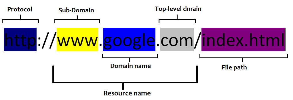
Next, when you are creating web pages, you also need to consider how the page will look in the browser, as certain browsers may display the information differently. HTML can be interpreted different in certain browsers, according to the chapter, which will result in the code not being interpreted how it was intended to. The chapter also explains that browsers use plug-ins to display information that is not in HTML form, such as videos. Also, you need to make sure that the code is written properly so that users on mobile phones can view that material and not just designed for a desktop computer. Domain names include protocols, which are the set of rules that control how the data is exchanged on a network. Furthermore, there are domain names of servers and server names can be broken down:

Image result for anatomy of a url

You can also choose a fun domain name! Sites are created on the computer and then transferred to the server, which gives you an chance to preview the site, keep a backup copy, and have it stored in case the site ever crashes. While setting a webpage  up, setting up a root folder is key so that you have somewhere to store the files. Planning is also essential in web design as well, as it is necessary to plan how many links that are going to be on a website, how many clicks it will take users to reach their destination, and you also want the page design to be usable and easy to navigate. A good tip is to try and assemble the information so that it can be reached in the fewest amount of clicks possible, to make it easier for users. Text must also be labeled, according to the book, so that the browser puts spaces between your paragraphs and other headings.

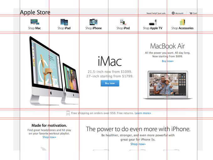
The site also needs to be uniform and consistent! Users will click away from a website that is unorganized and inconsistent throughout. This is another example of when I think having good planning is important so as to maximize space and minimize errors. Major sections, headings, paragraphs, block quotes, and lists are all ways to structure text and make sure that it has spaces in between. Links can be added to websites as well which can link to files in your website and images can be linked to as well. Margins, fonts, colors, and adding interactive multimedia content are all ways in which to change the characteristics of the appearance for a webpage and make it more user friendly and easier to navigate.

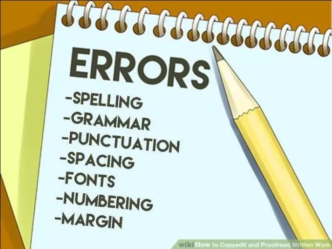
Accessibility is also an important aspect of writing code and designing a webpage. It is important to make the information accessible for all users, and you also need to consider who the primary audience of the information is. Some users may be colorblind, and others may not be able to read small print. Adjustments may need to be made for disabled users, and you can use WYSIWYG tools to do a scan of errors and run an accessibility report. Programs such as AChecker will perform the same function as well. Once the site has been checked for accessibility and approved for both desktop and mobile devices, it can be uploaded to the server, AS LONG AS it has been checked, double-checked, proofread, and re-checked again! After it has been published, you will also need to take these same steps to make sure that it has been uploaded properly, that all of the information is placed correctly, and that it is accessible for all users. All of these aspects of web design in this chapter and extremely important for creating a good webpage.

Image result for proofread

Chapter Six: Using Interface Design

When beginning this chapter, I was unsure as to what User Interface was. It is defined in the book as any system that supports human and machine interaction (167). The system includes software, hardware and input and output. An essential component to this chapter is interactivity, which is the communication between technology and the people that are using it, so people are able to choose what they need to communicate, what information they want, and how they want the information to be displayed. As technology advanced, the Graphical user interface was created to include scrolling bars, icons, menus, and different windows. To provide a personal example, I have recently gotten a new computer, and I can tell a major difference in this Mac as opposed to the Mac that I had in 2007. The interface is much more easy to use, and it is much easier to open icons and change various settings. It also has elements of personalization and customization, as it tailors my preferences based on how I have previously been using it, and allows me to customize the background, font, font size, and different layouts.

My computer also has an element of touch interface, which the chapter defines as a touch component that lets the user interact directly with what is on the screen by using one or more fingers. The one on mine is a touch bar that lets me control what is on the screen, which I have found much easier to use than computers where the entire screen is able to be touched. Siri is also ready to go on this computer as well, which is an example of voice interface, because I am able to command the computer to do different things with my voice.

Image result for apple touch bar


Augmented reality is another interesting topic that more people have started to talk about and explore. It is a modified view of reality, and I was interested to read more about the Google glasses, which I had never heard of. These glasses let the wearer take pictures and even use the Internet!

Image result for google glass

Navigation of the user interface is key, as it allows for the user to know how to make the computer perform actions. There are different types of navigation, broken into primary and secondary navigation. Primary organizes content according to what the user is most interested in, and secondary organizes content that is less visited by the user. An example of a primary navigator are menus, and examples of secondary navigators are tabs and footers:

Image result for primary and secondary navigation

There are also different types of menus, which can be vertical or horizontal, or accordion style. Tabs can also be used to visualize a lot of information and separate pages, as the user can switch back and forth between them. Home links allow for the user to go back to the home page of a website and breadcrumbs allow the user to find their way back to the home-page. Links can be added to the footer of a website, and it is also where you can find the Contact, About, or FAQ section of a website. Footers are used to display secondary information. Conveniently, user interface plays a huge role in organizing information for us to access easily.

Thumbnails, Carousels, pagination, and archives are all different ways to organize information as well. The most interesting of these to me is the concept of pagination, which is when you break information up to be shown in different pages. This allows for the user to preview how much content is going to be on the topic in the next pages. It is always at the end of a Google page, as seen in the iconic image below:

Image result for google pagination

Before tailoring, websites all looked the same, but now websites are personalized and customized for the user to make changes. Forms are another important aspect of using the Internet, as filling out forms electronically online is very easy and less time consuming. Some doctors offices are even switching from paper forms to all electronic! Usability and learnability are also important aspects of user interface design, and so far the Mac is the easiest computer to lean and explain to people in my opinion. Once people learn how to use a Mac, it becomes a fast favorite and preference over a PC. Efficiency and error management are also important components to me, as being able to perform tasks efficiently without having to worry about a shutdown is an important part of being a college student. Additionally, having a computer that is able to fix itself is also helpful as well, and saves time and money. Accessibility is also essential as well, so that everyone has visual, auditory, and physical access to technology. The chapter includes a great example of the iPhone, which is easy to customize in the accessibility menu based on personal needs. Having the option to customize all of these aspects, along with having a smooth functioning user interface design, are extremely vital so that people can use the product properly and efficiently!

Image result for accessibility iphone

Chapter Five: Page Layout

We should not forget the overrunning theme throughout all of the chapters, which is PLAN PLAN PLAN! Page layout is a key instance when planning will be extremely beneficial and necessary to creating a visually appealing, successful page, in which the content is displayed so that it can be easily viewed. I have never used Adobe Indesign, but have heard reviews about the software that are positive. Regardless of the software, knowing where to place certain images is a key element of page design.

logo(1)

According to the Gutenberg diagram, which came from the Gutenberg press, it is essential to have the text on a page distributed evenly. The digram slices a page into four equal parts and asserts that there is a gravitational force on a person’s eye that pushes their gaze down and to the right of the page:

Image result for gutenberg diagram

The most common type of layout, according to the chapter, is the F-Layout, which organizes the content on a page so that the left edge serves as an anchor for the eyes, and the user scans the page in bursts until they reach the bottom, with each scan becoming shorter as the viewer reaches the end. Conversely, the less popular Z-Layout is designed so that the reader reads the top part of the page and the eyes gravitate downwards diagonally across the page and then to the right as they reach the end. My personal preference when reviewing these two layouts in the chapter is the z-design, because it appears to be more simple and have less information covering the page.

Image result for f layout

There are other different ways to organize content as well. The method of chunking body copy is when the information is broken into chunks so that the visual density of text on a page is reduced. Headings can also help when distinguishing text and images on a page, because headings make it easier to scan a page and pick out important information. Or, one can use the Grid System, in which vertical and horizontal lines are used to divide information into smaller parts. A tip that the chapter mentions is using graph paper to create drafts of social media pages, so that the pages can be scaled, and then mapped and  planned out. This is another example of when it is good to plan before-hand, so that the information on the page can be well-thought out and space used in the most effective way. In the image below, it is clear that all of the content on the page has been symmetrically planned and placed strategically so as to maximize space and visual appeal. It is also an example of a grid that has different columns.
Image result for the grid system web design

Tables can also be used, and manipulating the cells when designing a table can be beneficial to plan the structure of a page. Templates are another great example, and are great for beginners to use when building a page. These can be purchased, or some can be acquired for free. There is also a difference between static and dynamic pages. Static pages use the same layout for every viewer of the page, while dynamic pages have content that changes over time depending on the individual viewer. The Facebook example mentioned in the chapter is interesting because I did not know Facebook is continuously changing deepening on who is using the site.

Fixed layouts have a height and width that is predetermined, while fluid layouts vary depending on the resolution of the device that the viewer is using to look at the page. Regardless of the methods, having a well-thought out plan before designing a page is extremely beneficial to creating one that is visually pleasing. My personal favorite method to do so from this chapter is the grid method, because it is the most detailed. All of the content of the page can be scaled to size and put on the page before hand, which can allow for the creator of the page to find errors, and also show the visual to others to get opinions of how it looks. All of these strategies are why it is always important to plan beforehand.

web-page-layoutstock-vector-hand-drawn-website-layouts-doodle-style-design-website-layout-doodle-web-page-graphic-template-3946400050546abae82ad057197f4542e0a3f2005

Chapter Four: Visual Communication

Visual Communication investigates how ideas and information are spread through visual mediums. According to the chapter, visual communication revolves around the interaction of content and form. Content consists of what is being shared, such as stories or information or any other form of tangible work. Form, is the way that it is designed for people to view or consume. Essentially, content and form work together to provide a message that is engaging, coherent, and understandable. Having a balance of both is also important so that one does not overtake a distract from the other. Each should complement the other so that the message from the content is clear to the viewer.

visual-communication1.jpg

One important component of content and form comes from the communication theorist Marshall McLuhan who stated that, “the medium is the message” (112). An example that the chapter employs to explain this is the overuse of software programs that distract and take away from the overall message of content. Having a balance of the message and the medium is key, so that the medium and the message work together to produce visually appealing information. This is when the concept of “less is more” is important to remember, so that the content is not overwhelmed by overpowering graphics, too much text, or simply having TOO MUCH. An example of this from my personal life are political campaign websites, which candidates use when they are running for office so that voters can read about them, donate money, or find other information about the candidate. Some websites are text heavy, which leaves the viewer to easily become distracted and click away. Other websites have too many graphics, which overwhelm the viewers eye and cause them to click away. Finding the right balance in having visually appealing photos, text, and graphics is essential to having a successful campaign website.

less-is-more.png

Aesthetics are important to consider because they too can engage a viewer’s eye or disengage a viewer. There are different elements of design that contribute to whether or not the viewer finds content aesthetically pleasing. According to the chapter, Design is the strategic arrangement of visual elements within a two-dimensional space to form a complete impression. The designer will fill in space and add text and images where necessary, while keeping in mind the ”less is more” rule. This is where having a solid plan before beginning is vital in order to use time efficiently and not make simple errors or mistakes when creating content or editing. When using a camera, the design space is called the field of view, and the depth of a digital space can be changed. iPhones now have an option when taking photographs called the “depth-effect” which blurs out images in the background and makes amateur photos look somewhat professional. Curved lines, straight lines, shape, and form are all aspects of photos that should be considered when taking a picture depending on the intended visual design. Plus, you can visually change or alter an image in order to improve it. Shape adds a two-dimensional element to photos while form adds dimension and depth to the shapes. An interesting example from the chapter is the photo of the person walking on a curved walkway, and the caption of the photo explains that the S curve in the picture guides the viewer’s eye. I included a photo below, in which the curved pathway and stepping stones draw the eye to the person in the photograph:

FH03MAY_029_65_109

This picture also includes a lot of texture from the grass, which makes the viewer imagine what the soft grass would feel like. There are also a lot of vibrant colors, and overall this picture is very visually appealing. In addition to all of these elements, there are some others that should be considered as well. Patterns add reoccurring visual images to a space and add interest and depth to an image:

Wood-Stack-Herringbone-Pattern

The herringbone pattern above also has texture from the wood, and also achieves the principle of unity, which is that all of the components of the photo come together to form a coherent design. Other aspects of this picture that coincide with the concepts in the chapter are balance, proportion, similarity, repetition, and the contrast between the light and dark pieces of wood. The image is balanced as the pieces of wood are equally distributed throughout the image, and the pieces of wood are in proportion to each other. Plus, they are different yet still similar enough that they contribute to the entire image, and the pieces repeat enough times to add visual interest and engage the viewer’s eye. All of these aspects of visual communication are important to strengthen the image as a whole.

The last interesting topic from this chapter is psychological closure. Psychological closure is the ability to complete mentally a visual pattern when only given partial information. The triangle figure below is an example because our mind fills in the gaps with the image of a star, even though we do not physically see one.

Kanizsa-triangle-illusion.jpg

All of these elements of visual design that are discussed in this chapter are interesting, and if we consider them, our work can become more thoughtful and creative. Who knew that visual images could be so insightful?

Chapter Three: Project Planning and Evalutation

PLAN PLAN PLAN– no seriously, plan. And then, check over your plan. And before executing your plan, make sure that it is coherent. This aspect of building multimedia was one that I had not yet considered, and this chapter helped me to realize that it is much more beneficial to plan everything out first before setting off to record a video or build a website. While we often think of planning as mundane, some of my best creative work has happened from sitting down and planning before delving right in to a project or assignment. Even finding someone to listen to your plan will help to shape it into its best form. Creativity also flows when thoughtful brainstorming is happening, and the best way to do this is to take the time to plan, strategize, brainstorm, and let the creativity flow!

planning.jpg

This chapter teaches us about Shannon and Weaver’s mathematical theory of communication that is based on a linear transmission model. Thankfully, I was able to find this model to insert here, so that it is easy to learn and understand while explaining it:

shannon-and-weaver

Information flows in this model from the source so the destination, or receiver of the information or message. This model, according to the chapter, shows us just how important planning messages is, because the source is the main party. In mass media, the source dictates the messages that will be sent to the audience. Because of this, it can be inferred that knowing what the source of the information is is necessary to planning how it will be conveyed or depicted to the audience, so planning it our before hand is essential to it making sense.

Now, lets shift to users. “A user is a more active and self-aware consumer,” according the the book. Thus, we are all users. I am using this website right now, so it would make sense to call me a user rather than the audience. The Three-P’s are: pre-production, production, and postproduction, in their respective orders. Preproduction centers around the preplanning of a project, and an example of something you would do during this phase is script-writing or making a storyboard of pictures for the project. Next, the production phase would consist of actually performing the recording or interviewing for the project. So, in this phase, the script that was mentioned in my earlier example would come to life, and the team of directors, camera operators, production coordinators and managers would be responsible for shooting the footage as the script is executed. Lastly, the postproduction aspect of the project consists of assembling everything together.

User-centered design comes from human and computer interaction. The User Experience Professionals Association divides the user-centered design strategy into four phases, which are analysis, design, implementation, and deployment. The analysis phase is when the two groups that are working on the project meet, thus called the client team and the project team, according to the chapter. In this phase, conducting research and putting data together is essential to identifying the target group of the information and having enough data about the client or company to finish the project. In the second phase called design, designing the structure of how the data will be presented will help to figure out how the information will ultimately be organized and arranged for the final product. For example, you may want to create a mock-up, which is a mock of the real page so that editing and fine-tuning can be done before the project is completed, according to the chapter. Next is phase three, which is the implementation step. This is when the final version is turned into a website or app or whatever you have been assigned to do by the client. This leads into the last phase known as deployment, when your content that you have created is distributed and published for people to view. Revisions may come after of course, but for this phase the bulk of the work is complete and the information has been checked, double-checked, fine-tuned, and made ready for distribution.

All of these phases illustrate why strategic planning is essential before-hand to use your time wisely and have a clear outline of ideas and strategies. So, PLAN PLAN PLAN!

Chapter Two: The Computer

Mac-vs-PC

Do you use a Mac, or do you prefer a PC? We are lucky to have the choice, as thanks to the evolution of the computer, we are able to have a device that we can easily access at home or on the go. Before the idea of the personal computers, computers were large and not very user friendly for the average person. In fact, if we saw some of the first “computers” we might not even know what they are (see image below for a laugh!).

Yes, the images above are all of computers! As we switched from large computers to smaller computers throughout the years, the microprocessor was invented in 1971 and developed for more complicated use in later years. This reminded me of the movie Hidden Figures, in which actual people do the all of computing for NASA and are surprisingly called human computers. Then, thanks to Steve Jobs and others, came Apple I and Apple II in the late 1970s. The PC came later, in 1981, from IBM. The digital revolution was just beginning as the Macintosh program started and Microsoft began to produce software and operating systems for computers. I am thankful for my laptop, as well as my hand-held computer, which are our ever-convient smartphones, according the the chapter. Operating systems are another interesting component of computers, as one of the tables in the chapter shows a timeline of the Mac OS X software from 2001-2015. As someone who just purchased a new computer less than a month ago, I am glad that Apple sends updates to the computer so that updating them is easy and user-friendly. Apps and other tools that we can access on our smartphones and computers are a necessary part of engaging with technology, and they also are easy to update as well. (My favorite apple happen to be Instagram, Snapchat, and YouTube). messaging-apps

Understanding the CPU, Hard drive, and RAM of a computer are all essential to being able to fix or attempt to fix your computer if you have a problem with it. This leads to The Human Interface, which is the hardware and software controls that allow people to operate the computer, according the the chapter. Inputting and outputting information are all important aspects of the computer and how it functions, and often these tasks are ones that we do not think about as our computers are so easy to use as technology has developed. While most people do not use a computer mouse now, I can remember when it was a necessary part of navigating computers, and most people still have to use them if they are navigating from a desk-top computer. Learning how to navigate the keyboard is also something that is easier and takes time and practice to become skilled and fast at, especially when learning all of the different shortcuts, which let you easily save time when opening applications, saving documents, closing applications, or editing things such as text.

0051309_gigabyte-km5300-slim-wired-desktop-set-desktop-usb-keyboard-mouse_600

Saving documents is easy as well, and keyboard shortcuts on my computer help me to save projects and documents instantly. Fixed storage, according the the chapter, refers to the non removable chip or storage device that is installed inside of a computer, so we have our hard drives to thank for saving and storing some of our essential information on our computers. When I purchased my new computer, I made sure to purchase one with a Solid State Drive, which the chapter mentions as well, and this means that the inside of the computer has solid sturdier parts. Having a SSD is good option for someone who carries their laptop to and from work and school a lot. While I no longer use CD’s, flash drives are a great way to store information, as is the Cloud. The book explains that the Cloud has the capacity to hold information but you must pay when it reaches it’s limit, and admittedly I pay $2.99 to Apple every month for all of the photos that I store on the Cloud.

No matter which way you chose to save information on your computer or tablet, the simple fact that we have access to these ways to communicate, create content, and surf the Internet is a great thing. Having a computer at your fingertips opens up a world to invent, design, and create innovative information. The way that the computer has evolved since the 1970s is an amazing thing to think about, and having the knowledge of how far it has come will help to predict the amazing things that it may be able to do in the future.