
Text is the visual representation of thoughts that are expressed through the human language. Ways in which we use text are: mobile texting, emailing, snail mail, and Tweeting. One of my favorite ways to manipulate text is to change the font of a document that I have written for fun to cursive or otherwise silly text to see how it looks. This leads into the topic of type, which is defined in the chapter as being the character that is created to communicate written information.
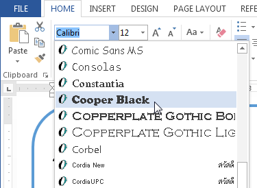
Letterform applies to letters and characters, and typography is the practice of creating and arranging type. Fonts and typeface are different, because typeface concerns the design, while font concerns executing the design in a certain size. The appearance of typeface should be unified, while font concerns the style and size of the words on the page. The book explains that Times New Roman is a typeface, while Postscript 12-point Times New Roman is a font. Fonts are arranged into font families, which include all of the styles of a specific typeface.


Johannes Gutenberg is credited for inventing movable type, which had to be arranged by hand by the user. The type was organized into horizontal rows and ink would be applied to transfer the text to a piece of paper. However, this very time-consuming, and thankfully we now have electronic and digital type that can be chosen by the user based on the chosen or intended aesthetic.
It is also important to consider legibility and readability. Legibility are the characteristics of the typeface and readability is how easy the text is to read once it has been typed. There are other aspects of typography as well, such as stroke, contrast, and stress of the text. Stroke is noticeable in curved letters, and it is when a pen moves horizontally, vertically, curved, or diagonally. The change between thick strokes is called the contrast, and stress is the location of the transition in the letter from thin to thick lines. Other characteristics are when the text is made bold or italic, and the proportions of text should be taken into a account for readability as well. When text is made bold, the thickness is adjusted to match the increase in the stroke thickness. Italic typefaces are intended to make the text look handwritten. Serifs are decorative accents that are added to the end of a stroke, according to the chapter, and can make the text look more visually appealing or interesting.
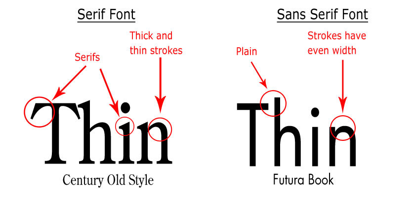
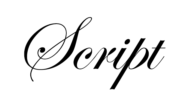
Sans serif typefaces are designed without serifs. This type is ideal for title headings, and are best when designing webpages or other electronic mediums, which I did not know. Keeping this in mind is important for creating websites and webpages so that the text appears uniform on the page. You can also chose between decorative typefaces or script typefaces. Script typefaces are slanted and look similar to cursive writing.
The keyboard also has the capability to insert special characters such as the ones below:

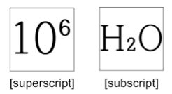
You can customize the font style, strike through certain words, put things in capital letters, and emphasize certain words using the Bold and Italic settings. True font styles are when the designer changed certain aspects of the text while designing it, and faux font styles are computer generated. Changing the font size can also be done to subheadings to emphasize certain images on a page. Plus, underlining can be used to emphasize words of phrases as well. You can also customize font color, and highlight certain words on the page. Superscript characters are smaller characters that are above a letter and subscript characters located are below the characters:
Leading is the amount of space that is between lines of text that are vertically adjacent, and lines must be placed strategically together so that they are not too far apart or too far together. It is also necessary to consider alignment, justification, and distribution when aligning the text on a page. Distribution is when you make sure that the page is equally distributed from each corner, and when the page is aligned equally the page is justified. All of these must be precisely done to scale so that the text is visually accurate on a page, and a tip is to use a grid to map out where the text is going to go. According to the chapter, grids can be accessed through software programs, and grids make aligning text efficient and accurate.
Text can also be altered to make it more visually appealing and interesting, which is called font transforming. An example of this is warping, which is when typeface is distorted or manipulated to create variety. Another example is stroke, which is when colored outlines are added to type to add variety and interest. One thing to keep in mind for this chapter is that less is always more, and making sure that the text is not too overdone or silly looking is important to having text that communicates ideas effectively to the intended audience. All of these aspects of text are interesting to consider, and must be taken into account when designing webpages and other forms of media.

All information taken from: Multimedia Foundations: Core Concepts for Digital Design.
Costello, Vic, Multimedia Foundations: Core Concepts for Digital Design (New York: Routledge, 2017), 235-263.
LikeLike